
At Taught by Humans we very much stress we are an AI and Data education company. We still focus on Google Sheets, SQL and Python, as well as Data Thinking, How to Do Data Analysis and Data Visualisation. I am a data person by background so sometimes I wonder if I overemphasise the importance of these skills.
AI is Making Data Irrelevant - Or is It?
But when OpenAI released GPT-5 on 5th August 2025, apparently the most advanced AI model, it was their graphs which everyone was talking about.
The particular graph in question was comparing the performance of thinking models for software engineering.
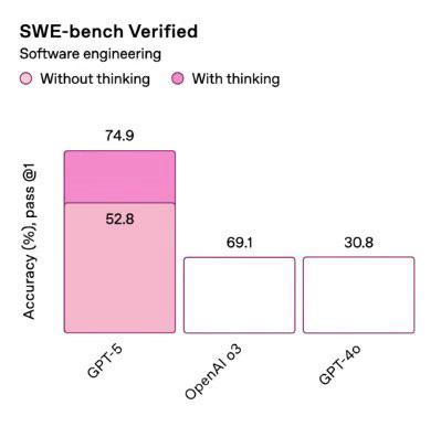
A graph comparing OpenAI models
The graph has a colour coded legend with two shades of pink for Without thinking and With thinking. However they have only been applied to one model. So it’s a bit confusing (if you know these models - o3 uses thinking always and GPT-4o doesn’t have this ability - so should they be coloured in as well?)
But that isn’t the real issue - it’s the size of the columns. 69.1% and 30.8% are the same size. And apparently 52.8% is bigger than both of these.
What the graph is trying (and failing) to communicate is:
- GPT-5 without thinking performs better than GPT-4o (52.8% is bigger than 30.8%)
- GPT-5 with thinking performs better than OpenAI o3 (74.9% is bigger than 69.1%)
And this would have been easy to do with using the colours and the right sized columns.
The graph is missing one of the key rules of data visualisation - don’t make me think.
Lesson - even if you’re building something seemingly amazing and groundbreaking, the data skills needed to prove how amazing it is are just as important.
Maybe I do go on about data skills a bit. But graphs like this are exactly why we built Taught by Humans.
Here’s a Really Quick Checklist to Help Build Beautiful Charts
Things to check if a chart feels off - or you want to make sure it's doing the right talking
- Do the bar sizes match the numbers? Sounds basic, but it’s the easiest thing to get wrong - and the easiest way to mislead.
- Is the axis doing anything strange? Starting from 50 instead of zero? Using different intervals? That can shift the whole story.
- Do the colours actually mean something? If there’s a legend, it should help. If not, the colours should still guide the eye - not distract it.
- Can someone read it in five seconds? A good chart doesn’t need an explanation. If you have to explain it, something’s unclear.
- Is it saying what you think it’s saying? Worth double-checking. Titles, labels and design choices can accidentally tell the wrong story.
We get that prompting is the hot skill right now. But data fundamentals aren't going anywhere any time soon.